

Introduction
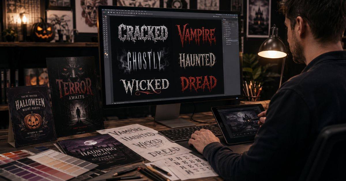
Typography can set a design’s mood before viewers notice its colors or imagery. A Freaky Font creates a creepy or dramatic feeling through sharp edges, broken strokes, rough textures, and distorted shapes. It is often used for Halloween invitations, horror posters, game artwork, social graphics, and eerie websites.
Decorative lettering must still suit the audience, support the message, and remain readable. When every line uses complex typography, the result feels confusing rather than creative.
This guide explains how to choose, pair, style, and apply Freaky Font designs. It covers tone, combinations, color, texture, accessibility, licensing, and common mistakes so you can create spooky visuals that remain polished and clear.
What Makes a Font Look Freaky?
A Freaky Font breaks familiar visual rules. Its letters may appear cracked, scratched, stretched, melted, narrow, hand-drawn, or uneven. These features can suggest fear, mystery, fantasy, danger, or dark humor.
Common characteristics include
- Jagged edges that suggest damage
- Tall letters with a gothic feeling
- Uneven baselines that look unstable
- Rough surfaces resembling rust
- Heavy shadows that create drama
- Irregular spacing that adds tension
Context changes the meaning. Dripping letters may feel playful on a children’s card but disturbing on a realistic poster. Define the intended mood before choosing a style.
Match the Font to the Project
The best Freaky Font fits the project rather than being the most dramatic option. Audience age, format, viewing distance, and message length should guide your choice.
| Project | Recommended Style | Best Placement |
| Children’s Halloween invite | Rounded monster lettering | Event title |
| Haunted attraction poster | Distressed serif | Main headline |
| Horror film artwork | Narrow serif or rough sans serif | Film title |
| Dark fantasy website | Elegant gothic display font | Hero section |
| Social-media promotion | Bold textured lettering | Short announcement |
Test the actual words before deciding. Some typefaces look impressive in samples but become unclear in long titles. Look over the drawing at its full size and check the important characters.
Use Spooky Typography as an Accent
A Freaky Font works best as a focal point. When it appears in every paragraph, button, and label, the design loses hierarchy. A simple structure is:
- Decorative lettering for the title
- A clean bold font for subheadings
- An easy-to-read sans serif or serif font for body copy
- A simple style for buttons
- Neutral text for dates and prices
A haunted-house website can use eerie typography in the hero banner while keeping navigation clear. Leave space around the title so its unusual shapes remain visible.
Build Effective Font Pairings
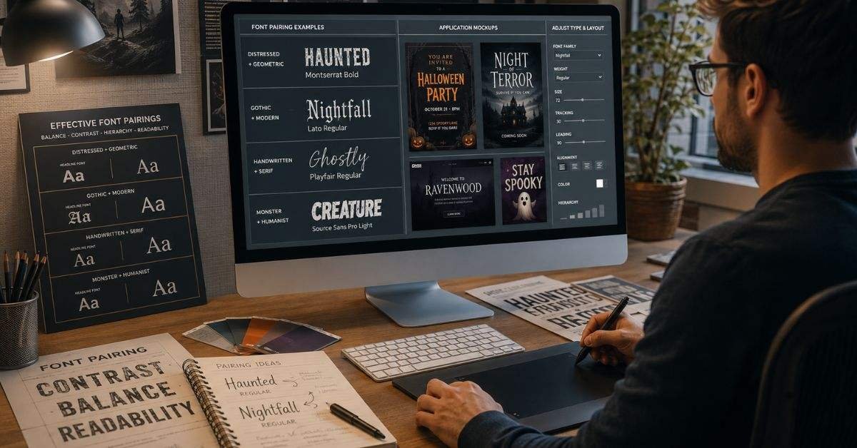
A Freaky Font needs a calm supporting typeface. Pairing two highly decorative styles creates visual conflict because both try to dominate the layout.
| Decorative Style | Supporting Typeface | Main Benefit |
| Rough and distressed | Geometric sans serif | Adds structure |
| Gothic blackletter | Humanist sans serif | Improves clarity |
| Uneven handwriting | Traditional serif | Creates stability |
| Thin ghostly letters | Medium-weight sans serif | Adds strength |
| Heavy monster lettering | Light sans serif | Produces contrast |
Most projects need only two font families. Create variety through size, weight, spacing, and capitalization. If both fonts compete, simplify one of them.
Control Color, Texture, and Effects
Color and effects can strengthen a Freaky Font, but excessive styling may hide the letters. Black, dark red, ash gray, bone white, muted orange, deep green, and purple are common choices, although contrast matters most.
Useful treatments include
- Fine grain for an aged look
- Soft glow for supernatural themes
- Hard shadows for retro horror
- Faded ink for historical settings
- Scratches for survival themes
- Light fog covering part of a title
Use one or two effects rather than stacking outlines, glows, bevels, gradients, and shadows. Test the artwork at different sizes.
Keep Every Important Word Readable
A Freaky Font may look strange, but dates, addresses, prices, contact information, and calls to action must remain clear. Decorative typography should create an atmosphere without forcing readers to decode the message.
Use these checks
- Keep decorative phrases short
- Increase spacing when letters overlap
- Put essential details in a simple font
- Test the design on phones
- Review posters from a distance
- Check light and dark backgrounds
- Ask someone else to read it
Strong contrast is essential. Dark red may disappear on black, while thin gray text can vanish against detailed imagery.
Create Clear Halloween Invitations
A Halloween invitation needs mood and practical information at the same time. Freaky Font lettering can establish the theme, while a clean supporting typeface presents the details. Arrange information in this order:
- Event name
- Date and time
- Venue or online location
- Costume theme
- Safety guidance
- RSVP or ticket information
“Enter If You Dare” can use distressed gothic lettering, while the details use a bold sans serif. Decorative elements should frame rather than cover the content. Test printed and mobile versions.
Design Horror Posters With Restraint
A strong horror poster does not need extreme effects everywhere. Carefully placed Freaky Font text can create more tension when surrounded by negative space, darkness, or one unsettling image.
Match lettering to the horror category
- Rough brush styles suggest chaos
- Narrow serif letters support psychological horror
- Gothic forms suit supernatural stories
- Distorted clean fonts fit modern horror
- Faded lettering supports historical themes
Make the title readable at thumbnail size and keep credits quiet. Avoid copying famous film logos. Build originality through spacing, placement, texture, and color.
Add Eerie Fonts to Websites Safely
A Freaky Font used online must load correctly, respond to different screens, and remain readable on mobile devices. Use decorative web fonts mainly in hero headings, banners, or short promotional labels.
Before publishing
- Confirm that the license allows web use
- Add reliable fallback fonts
- Limit unnecessary weights
- Compress font files
- Test slower connections
- Review small-screen headings
- Keep menus and forms simple
Fallbacks matter because custom files may fail to load. Avoid spooky lettering in long paragraphs, checkout pages, legal information, or navigation.
Avoid Common Spooky Design Mistakes
Freaky Font designs often fail because every element is made dramatic. When backgrounds, images, colors, textures, and lettering compete, viewers cannot identify the main message.
Common mistakes include
- Mixing unrelated horror typefaces
- Stretching letters excessively
- Placing textured text over busy photographs
- Using dark colors without contrast
- Adding graphic effects to children’s designs
- Ignoring commercial licensing terms
- Copying recognizable horror branding
- Using decorative lettering for paragraphs
Start with a black-and-white draft. If the hierarchy works there, the final artwork will usually be stronger. Compare alternatives at a small size.
FAQs
What is a Freaky Font?
Freaky Font is a general term for decorative lettering that looks creepy, gothic, strange, supernatural, or playfully scary. It describes a category rather than one specific typeface.
Where can it be used?
It works well in Halloween invitations, horror posters, gaming artwork, event banners, social graphics, packaging, and short website headings.
Can it be used for body text?
Usually not. Complex letterforms slow reading, so clean serif or sans-serif fonts are better for descriptions and instructions.
How many fonts should one design use?
Two font families are normally enough: one decorative display font and one readable supporting font. Size and weight can create the remaining hierarchy.
Are free spooky fonts suitable for commercial projects?
Not automatically. Some are free for personal use only. Before using a font in ads, websites, products, client work, or paid products, make sure you read the license.
Conclusion
Freaky Font typography can transform a plain layout into a memorable Halloween, gothic, supernatural, or horror design. Its unusual shapes create emotion quickly, but successful use requires more than selecting the strangest typeface. Designers must consider audience, purpose, readability, spacing, contrast, size, and licensing.
Use decorative lettering mainly for titles and short highlights. Pair it with a clean supporting font and test the design in its real environment. Invitations need organized details, posters benefit from restraint, and websites require dependable fallbacks.
A well-used Freaky Font strengthens the story and directs attention without confusing the reader. Begin with a simple Freaky Font layout, compare several options, and refine the version that creates the intended emotion while keeping every important message clear.